
Color psychology in TV ads leverages neuroscience to evoke specific emotions and drive viewer behavior. By strategically selecting hues, brands can build trust, create urgency, and significantly boost engagement and conversion rates across global campaigns.
Right now, television remains a powerful medium for brands seeking to cut through a sea of content and connect with viewers on an emotional level. Currently, advertisers have mere seconds to seize attention and convey a compelling message before viewers switch the channel or tune out. One of the most effective yet often underutilized tools to achieve this is color psychology in TV advertising—selecting hues that resonate subconsciously with audiences to evoke specific feelings and behaviors. This year (2026), marketers who harness this science-backed strategy can significantly boost engagement, recall, and conversion rates across diverse demographics.
By understanding how colors influence perception, advertisers can tailor visuals to align with campaign objectives, whether the goal is to instill trust, ignite excitement, or foster a sense of calm. Research confirms that color choices trigger neural pathways linked to emotion and decision-making. Implementing these insights in television advertising, from storyboarding to post-production, can transform generic commercials into memorable experiences that drive brand loyalty.
In this comprehensive guide, we explore the science behind color associations, identify the emotional impact of key hues, and provide actionable best practices for crafting a cohesive palette in your next TV spot. We then delve into real-world examples from industries such as quick-service restaurants, finance, and technology, illustrating how leading brands leverage strategic color placement to achieve measurable results. Finally, we outline methods to test and refine your approach, ensuring each campaign maximizes its color-driven potential.
Understanding the Science of Color Psychology in TV Ads
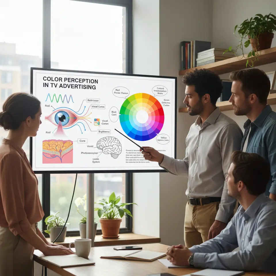
Color psychology in TV advertising rests on a foundation of neuroscience and cultural anthropology. When light wavelengths hit the retina, they are processed by photoreceptor cells and transmitted via neural pathways to the visual cortex. This rapid process not only interprets shapes and movement but also triggers emotional centers in the limbic system, influencing mood and behavior. The result is a subconscious response to color that advertisers can harness to shape viewer perception.
Researchers have documented that certain hues consistently evoke similar feelings across large populations, suggesting innate biological responses. Yet, cultural context adds another layer of complexity. For example, while red may signal danger or passion in Western markets, it symbolizes good fortune in many Asian cultures. Understanding regional interpretations is essential when planning international campaigns.
Advertisers must also consider variables such as saturation, brightness, and contrast. High saturation can convey urgency and energy, but if overused, it risks overwhelming viewers and diluting messaging. Conversely, muted palettes feel sophisticated and can underscore themes of reliability and calm. Effective color selection balances these properties to guide the eye and reinforce key messages without causing fatigue.
Moreover, studies show that up to 90% of snap judgments about products can be based on color alone, highlighting its critical role in brand perception. Visual hierarchy techniques also rely on contrasting hues to draw attention to calls to action, logos, and important text overlays. In television production, choosing complementary colors on the color wheel ensures that elements stand out without clashing. For instance, pairing a warm orange CTA button against a cool blue background creates a focal point that naturally guides the viewer’s gaze.
Cultural relevance extends beyond national borders; even subcultures within a country can interpret colors differently. Sports teams, community organizations, and local traditions may imbue specific shades with unique meanings. Exploring partnership marketing trends in digital advertising can also reveal how collaborative branding efforts adapt color schemes to appeal to diverse, cross-border demographics. Brands operating regionally should conduct audience segmentation analysis and field research to tailor color schemes to local sensibilities.
Finally, the advancement of high-definition and HDR formats this year (2026) allows advertisers to exploit a broader color gamut and deeper contrasts. While these technologies offer richer visuals, they also demand more precise calibration on set and in editing suites to maintain brand consistency across various broadcast standards and streaming platforms.
By integrating scientific principles of color perception with practical broadcast considerations, marketers can craft television advertisements that resonate emotionally, stand out visually, and strengthen brand identity.
Emotional Resonance: How color psychology in tv ads Influences Viewer Perception
At its core, color psychology in TV advertising leverages the emotional power of individual hues to shape viewer reactions. When applied strategically, each color can reinforce the narrative and prompt specific behaviors.
Red: Energy, Urgency, Passion
Red is arguably the most attention-grabbing hue. As a long-wavelength color, it stimulates the retina more intensely, elevating heart rate and excitement. This makes red ideal for limited-time offers, sale announcements, and calls to action that demand immediate viewer attention. However, use it judiciously; excessive red can convey aggression or danger, potentially alienating risk-averse audiences.
Blue: Trust, Security, Calm
Blue resonates with stability and dependability. Its short-to-medium wavelengths are associated with the sky and ocean, evoking feelings of calm and trust. Financial institutions, healthcare providers, and technology brands often incorporate blue in their TV ads to reduce viewer anxiety and underscore credibility. Lighter shades of blue can feel refreshing, while darker navies communicate authority.
Green: Growth, Health, Prosperity
Green blends the calming attributes of blue with the energy of yellow. It symbolizes nature, well-being, and financial growth. Eco-conscious brands, wellness products, and investment services frequently use green to suggest sustainability and abundance. It can also signal forward movement in transportation or software contexts.
Yellow: Optimism, Warmth, Caution
Yellow radiates happiness and positivity, making it suitable for lifestyle and outdoor ads. The human eye perceives yellow more readily than other colors at medium brightness, allowing it to capture attention quickly. Yet, too much yellow can strain vision and imply caution, so reserve it for highlights and accents rather than dominant backgrounds.
Purple: Luxury, Creativity, Wisdom
Purple combines the stability of blue and the energy of red, creating an association with sophistication and imagination. Historically linked to royalty, purple signals exclusivity and premium quality. Beauty, fashion, and high-end technology campaigns leverage purple to position products as aspirational and innovative.
Crafting an Effective Color Palette for Your TV Ad Campaign

Crafting a compelling color palette requires a systematic approach rooted in your campaign objectives and brand identity. Follow these steps to ensure your TV advertisement leverages color psychology in TV advertising effectively.
Define Your Emotional Goal
At the outset, clarify the primary emotion you want to evoke—whether excitement, trust, nostalgia, or comfort. A law firm might aim for stability, favoring deep blues and muted grays, while a sports brand may seek adrenaline-driven responses with vibrant reds and electric oranges. Documenting your emotional goal guides all subsequent color decisions.
Select Primary and Secondary Hues
Once your target emotion is clear, choose a primary hue that embodies it. Use color psychology research from authoritative sources like the International Color Consortium to identify shades that align with your goal. Next, pick one or two secondary colors from adjacent or complementary positions on the color wheel to support the primary tone. For instance, pairing a royal purple with soft lavender and crisp white can convey both creativity and sophistication.
Establish Contrast for Key Elements
Visual hierarchy is essential in directing viewer attention. Your call-to-action, logo placement, and essential text should use high-contrast colors relative to the background. If your background is predominantly dark blue, a bright yellow CTA will immediately draw the eye. Ensure your on-screen text meets WCAG contrast guidelines to maintain accessibility standards.
Maintain Brand Consistency
Consistency fosters recall. Extend the chosen palette across all marketing channels—including social media, landing pages, and printed materials—to reinforce brand identity. This unified look helps audiences connect disparate touchpoints, strengthening memory retention. Develop a style guide outlining hex codes, usage rules, and examples of correct and incorrect color applications.
Leverage Technology and Testing
A/B testing is a powerful tool for visual assets. Produce multiple rough cuts of your TV spot with slight variations in color schemes. Deploy these versions to small segments of your target audience via online platforms. By harnessing advanced programmatic advertising, you can track real-time engagement metrics to see which color variations perform best before launching a full-scale national broadcast.
Iterate Based on Data
Use both quantitative data and qualitative feedback from focus groups to refine your palette. If viewers report that certain colors feel jarring or don’t resonate emotionally, adjust saturation levels or shift hues closer to target metrics. Continuous iteration ensures that your final color strategy not only looks polished but also delivers optimized performance.
Collaborate with Production Experts
Finally, involve colorists and post-production specialists early in the process. Their technical expertise in color grading and calibration helps preserve your intended palette across various broadcast equipment and streaming platforms. This collaboration ensures that what you see on set matches what viewers experience on TV, preventing unintended shifts in hue or brightness.
Real-World Applications and Optimization

Examining real-world examples sheds light on how leading brands implement color psychology in TV advertising to achieve remarkable results. Integrating these visual tactics with modern video advertising strategies allows marketers to create more dynamic and cohesive viewer experiences across screens.
Fast-Food ‘Limited Time Offer’ Spots
Quick-service restaurants often deploy bold reds and energetic yellows to stimulate appetite and convey urgency. A national burger chain recently introduced a 10-day menu item during prime-time slots, featuring saturated red backgrounds contrasted with bright yellow text. The palette was chosen to mirror natural signals of ripeness and heat, subconsciously prompting hunger. A subsequent analysis by Nielsen revealed a 25% increase in same-day online orders compared to an identical spot aired in pastel tones. This case underscores the potency of color-driven urgency triggers in driving short-term spikes.
Financial Services Commercials
Banks and insurance providers consistently rely on cool hues—primarily blues and greens—to foster trust and reduce anxiety. In one campaign, an investment firm pivoted from an orange-heavy palette to a combination of navy blue and forest green. The rebranded TV ad opened with serene aerial footage over water before transitioning to client testimonials overlaid in muted green graphics. Post–air analysis demonstrated a 40% lift in brand recall surveys and a 15% rise in web form completions, illustrating how trust-building colors can enhance both memorability and conversions.
Technology Product Launches
Brand-new gadgets and software platforms often embrace futuristic color schemes to convey innovation. A leading smartphone manufacturer’s launch spot featured deep purples and metallic silvers, evoking exclusivity and cutting-edge design. The spot was graded for HDR broadcasts to maximize color depth and contrast. Social media teasers with the same palette generated significant pre-launch buzz, and the product exceeded first-week sales projections by 18%. By aligning color strategy across TV and digital channels, the company crafted a cohesive narrative that reinforced product superiority.
In each example, rigorous measurement strategies—such as combining TV spot performance with companion digital ad analytics—played a pivotal role. Tracking click-through rates on landing pages reflecting the same color themes provided a holistic view of color strategy effectiveness, enabling marketers to fine-tune future spots.
Incorporating a measurement and optimization cycle for color psychology in TV advertising is essential to validate assumptions and refine strategies. The process spans pre-launch testing, live monitoring, and post-campaign analysis.
Pre-Launch Testing
Before airing a new TV commercial, conduct A/B tests with variations in color schemes. Online platforms such as YouTube and connected TV (CTV) services enable small-scale rollouts to segmented audiences. Compare viewer retention rates, click-through data on accompanying digital ads, and qualitative feedback from online surveys. Tools like Lookback and UserTesting can capture real-time reactions to color changes, providing nuanced insights into emotional responses.
Live Campaign Monitoring
Once your spot goes live, leverage data from multiple sources. Nielsen ratings reveal how many viewers watched your ad and for how long, while digital analytics track interactions with companion web or mobile experiences. Heat mapping software can analyze browser-based previews to see which colored elements command attention. Integrating these data streams in a centralized dashboard offers a unified view of performance against key performance indicators (KPIs).
Post-Campaign Analysis
After the campaign concludes, collect both quantitative metrics and qualitative feedback. Brand lift studies assess recall improvement attributable to color-driven messaging, while post-campaign focus groups dive into emotional perceptions and cultural interpretations. Survey instruments should include questions like “What color stood out most to you?” and “How did the ad’s color scheme influence your impression of the brand?”
Iterative Refinement
Use insights to adjust your color guidelines. If analytics show that a particular hue underperforms in driving clicks or retention, consider tweaking saturation levels or substituting an entirely different shade. Document these changes in your style guide, noting the rationale and observed impact on metrics. Over time, accumulating a library of color performance data helps predict which palettes will succeed in future campaigns.
Collaborating with Creative and Technical Teams
Effective optimization requires cross-functional collaboration. Creative directors, colorists, and data analysts should meet regularly to review findings and brainstorm adjustments. Technical teams, including broadcast engineers and streaming platform specialists, ensure color fidelity across various delivery channels, from traditional television networks to over-the-top (OTT) services.
Leveraging Advanced Technologies
Emerging technologies such as machine learning can accelerate color optimization. Algorithms trained on past campaign data can recommend palettes predicted to resonate most with your target demographic. For example, some platforms offer automated color suggestions based on millions of viewer interactions, streamlining the testing process.
Best Practice Summary
- Establish clear KPIs linked to color usage, such as viewer retention, brand recall, and click-through rates.
- Integrate A/B testing into both online and offline channels for comprehensive performance evaluation.
- Combine quantitative analytics with qualitative research to capture emotional and cultural nuances.
- Maintain an iterative workflow that updates color guidelines based on empirical evidence.
- Use technological tools to enhance precision, speed, and scale of color optimization efforts.
By treating color psychology in TV advertising as a dynamic, data-driven discipline, marketers can continuously improve their visual strategies. This structured approach ensures that each campaign not only meets creative aspirations but also drives measurable business outcomes.
Frequently Asked Questions
1. What is color psychology in tv ads?
Color psychology studies how hues influence viewers’ emotions and behaviors. In TV ads, selecting the right colors can strengthen messaging, drive attention to calls to action, and evoke specific feelings that align with brand objectives.
2. How do I choose the right color palette for my brand’s TV spot?
Start by defining the core emotion you want to elicit, such as trust or excitement. Select a primary hue that embodies that feeling, then pair it with secondary colors using complementary or analogous schemes.
3. Can I test color schemes before final production?
Yes. Conduct A/B tests on digital platforms or with controlled focus groups using rough cuts of your spot. Measure metrics like recall and click-through rates on companion ads to identify which palettes resonate most.
4. How do I buy TV ad space to test these commercials effectively?
Purchasing the right media placements is critical to ensuring your target audience sees your color-optimized ads. You can learn how to buy television advertising that actually works to maximize your media budget and testing phases.
5. Are traditional TV ads still worth the investment compared to digital?
Television remains a highly impactful medium for building mass awareness and brand trust. To understand the current landscape and ROI, read about how effective television advertisements really are when paired with data-driven creative strategies.
6. What are the best colors to use for a call to action?
High-contrast colors work best. If your ad features a predominantly cool background, a warm color like orange or yellow will make your CTA pop and draw the viewer’s eye immediately.
7. How do I maintain color consistency across TV and digital channels?
Develop a comprehensive style guide listing exact hex, RGB, and CMYK values. Collaborate with colorists and technical teams to calibrate your ads for various broadcast and streaming standards.
8. What makes a television advertisement truly engaging?
Beyond color, engaging ads require a strong narrative, a clear hook within the first five seconds, and relatable characters. Discover techniques to create a television ad that captivates your audience from start to finish.
9. Do different cultures interpret colors differently in TV ads?
Absolutely. Red signifies danger or passion in the West but means luck and prosperity in many Asian cultures. Always research local color associations before airing international campaigns.
10. What metrics should I track to evaluate color effectiveness?
Key metrics include viewer retention, brand recall lift, website traffic spikes during airtimes, and post-campaign survey responses regarding emotional impact. Combining these data points yields a comprehensive view of your color strategy’s success.
Conclusion
Color psychology in TV ads presents a powerful intersection of art and science. By leveraging the emotional cues embedded in colors—whether it’s the urgency of red, the trustworthiness of blue, or the sophistication of purple—brands can communicate complex messages quickly and memorably in today’s fast-paced media landscape. In 2026, advancements in broadcast technology and digital analytics provide unprecedented opportunities to test, measure, and refine color-driven strategies at scale.
Successful campaigns start with a clear emotional objective, followed by the deliberate choice of primary and secondary colors, high-contrast calls to action, and consistent application across all touchpoints. Real-world case studies—from quick-service restaurants to financial services and tech launches—show that color psychology in TV ads can significantly boost viewer engagement, brand recall, and conversion metrics.
To maximize results, marketers should adopt a data-informed approach: conduct A/B tests, integrate quantitative analytics with qualitative research, and collaborate across creative and technical teams to maintain color fidelity. Treating color psychology in TV ads as an ongoing optimization process not only enhances visual storytelling but also drives measurable business outcomes.
As audiences become more discerning, strategically applying scientifically backed color insights offers a clear competitive advantage. Experiment with targeted palettes in your next TV spot and watch your brand’s emotional connection and performance flourish.